How to monitor with Netdata, for absolute beginners
Netdata offers a wealth of metrics and alerts out-of-the-box, enabling the user to get an in-depth understanding of their system without having to set up anything at all.
From the beginning, we wanted to create a tool that everyone can use. A robust monitoring solution that is easy enough for all users that need to understand why their system is misbehaving.
Fast forward a couple of years, and we are proud of a solution that is not only very wide but also very performant.
That being said, we know that it can be daunting at times, due to a large number of available metrics. It hasn’t had to be that way though.
Let’s see what insights we can get about our systems without having to dig into hundreds of charts. This work could not have been done without the help of our Senior DevOps engineer @Austin_Hemmelgarn ![]()
![]()
Remember
We will be looking into a limited number of charts. Netdata has more than 200 integrations and we are proud of our coverage.
Learn more about our integrations
System Overview Section

This is the most obvious of the charts. it’s a great overview of our system and we should start troubleshooting only if:
- We observe performance issues
- System overview shows abnormal metrics.
A Note on the ordinary
In this guide, we will often mention the following phrase “metrics out of the ordinary”. This notion is very important.
In order to truly understand the metrics of your system (and subsequently set the optimal values for the default alerts), you need to monitor you system under normal load/condition over a prolonged amount of time (e.g say a week).
CPU charts
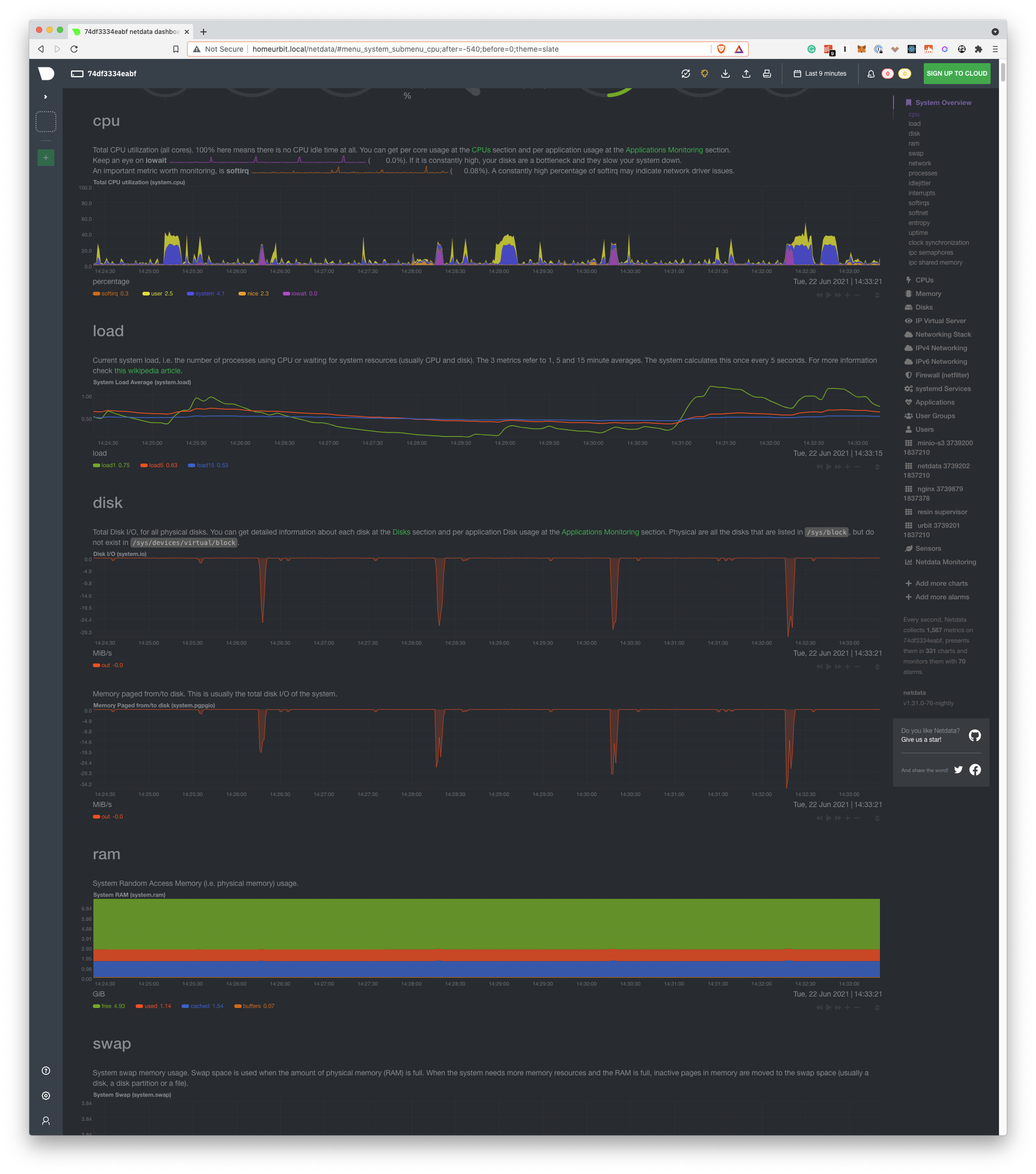
IOwait
It’s the time that the CPU waits for an IO operation to complete. It could be running other things, but it doesn’t.
How do I read this?
High iowait means that the system is iowait constrained. Usually, this is related to Hard Disk work, but it could be other hardware as well. If I see a consistently low value, that means that I use the CPU efficiently.
softirq
It’s the time spent on hardware interrupts handlers. For example, network code is very softirq heavy, as the CPU spends time in kernel mode to handle the network packets.
How do I read this?
It should be very low. Consistently high values mean that the system is not able to keep up with (probably) the network traffic.
CPU Pressure Stall Information (PSI)
In the abstract, it’s a measure of home much time is spent waiting for a resource to become available. The CPU could run other tasks, but can’t find an available CPU core.
This is only available on Linux systems. FreeBSD and MacOS don’t support this, thus you won’t find this chart on these systems.
How do I read this?
If you are not utilizing 100% of your CPU, this should be zero. Keep track of this for a couple of days to see the whole range of the “expected” spikes. You can set a new alert for a spike beyond the highest spike under normal load, that way you will know when an abnormal load is detected.
CPU Load
It’s the running average of the processes that are waiting for resource availability. Historically, it has been the only measure of CPU performance issues.
The difference with CPU PSI:
How do I read this?
Load measures how many processes are waiting for resource availability, while PSI measures how much time applications are waiting for resource availability.
Generally speaking, we care more about PSI than Load. If we are going to use Load, we should keep track of load1 because by the time the other running averages are high, then it’s already too late. The system is already throttled.
A rule of thumb is to set an alarm for the following value: 8(or 16)*number_of_cpu_cores. Note that this can greatly vary (ever 4 times could be too high) and it’s possible that by the time the alert is raised, that you can’t interact with the system due to the load.
Disk Charts

Disk IO
The first chart measures the DiskIO. It’s necessary to run Disk benchmarks to truly find the peak of your system and set the alerts accordingly.
How do I read this?
First I run my benchmarks to understand the peak performance of the disks. If I observe that during normal load the disk consistently reaches near the peak performance, then what I do is probably disk io bound and I need to upgrade my disk.
PageIO
It measures the data that is pulled from memory. Usually, it’s close to DiskIO.
Disk PSI
Conceptually, it’s the same as CPU PSI. The amount of time that processes are waiting in order to be able to perform DiskIO.
How do I read this?
The charts should be zero most of the time. If they are consistently non-zero, then the disk is a limiting factor on the system and we need to upgrade it.
Important Note
Viewing your Netdata dashboard is actually heavy in Disk IO, as data is being streamed directly from the system to your browser. That means that you will need to look at this chart at a time when you weren’t viewing the dashboard.
RAM Charts

RAM utilization
It’s the absolute physical memory in use.
How do I read this?
Ideally, I don’t want to see anything listed as free. If I have a lot of free memory, that means that I have more memory than I need. used should be approximately a bit above 50% and it shouldn’t be a lot larger than cached.
cached is memory that is used by the kernel to cache disk files for faster access. It is not used, as the kernel will use that memory if a process requires it.
If buffers are very high, that means that the system is under heavy network load. Even in a large server, buffered should be. a couple of hundred MBs. buffers are used to store network packets to be processed by the CPU.
Note
A system where the main application is taking care of memory caching (instead of the system) could have a lot of used and almost no cached. This is very rare and probably does not concern most of us.
RAM PSI
Conceptually, is the same metric as CPU PSI.
How do I read this?
If RAM PSI is consistently above zero, then the speed of my memory modules is a limiting factor. I need to get faster (not bigger) RAM.
RAM swap usage
When the system can’t find the memory it needs, it creates files on the hard disk and uses them as a sort of very slow memory.
Note
It’s worth noting that mac, Linux, and FreeBSD have an unintuitive use of swap. They will remove the swap files when no running process is referencing them, not when memory is freed. That means that a long-running process will continue to use swap files even if there is available memory.
To solve this, we should either reboot the system, restart the processes or disable and enable swap.
Note 2:
If you don’t see the swap chart, that means that the machine has no swap enabled. Netdata will not show charts that have zero values.
Network Charts

Total Bandwidth
It’s the total actual data that is being sent and received by the system.
How do I read this?
You need a baseline to read this. If you have consistently more traffic than expected, then something is off.
Important Note
Viewing your Netdata dashboard is actually heavy in network usage, as data is being streamed directly from the system to your browser. That means that you will need to look at this chart at a time when you weren’t viewing the dashboard.
Processes Charts

Blocked processes
It shows the number of processes that want to run but are waiting for something (e.g IO).
How do I read this?
It’s relevant to the baseline of the system. To consistently have 0-1 blocked processes is normal. If you have a bad disk, the number of blocked processes will be higher. Thus, a consistently high number may indicate some bottleneck in your system.
Context switches
It’s the number of times the CPU has to change context (e.g stop a process and run another, or stop userspace to jump into kernel space and process a packet).
How do I read this?
It’s relevant to the baseline of the system. High context-switching means that the system is not running efficiently, as the system has to change the context a lot of times. It’s a very costly operation for the CPU. To rectify an issue relevant to context switching is very related to the load that you are running.
A good rule of thumb is to check this chart if you observe performance issues but all the other charts appear normal.
Idlejitter
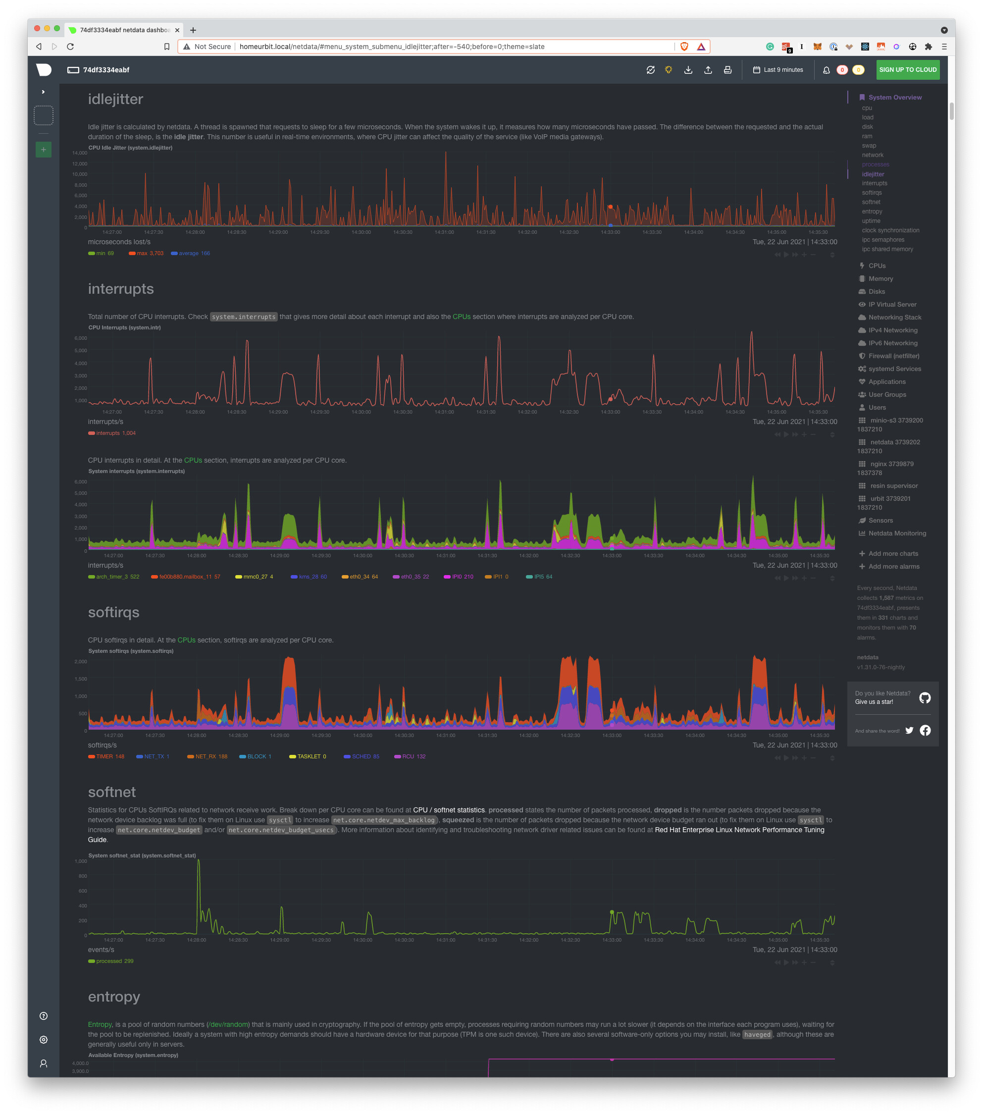
It measures how “off” is the CPU when performing very carefully timed operations. It’s relevant only when you care about ** real-time** applications, such as VOIP, driving servo motors and, time servers.
Softnet
It counts network receive interrupts processed by the kernel.
How do I read this?
We mainly care about 2 dimensions that should be zero most of the time. If you can’t see them, that’s a good thing, as Netdata will not display dimensions that are 0.
droppedshould always be zero, if it is non-zero your system is having serious issues keeping up with network traffic.squeezedshould be zero, or no more than single digits. If it’s in the double digits or higher the system is having trouble keeping up, but not to the point of losing packets.
Personal computers that have been converted to homelab servers usually have non-zero dimensions, as they are not designed to handle a lot of network bandwidth.
CPU

CPU Idle
It’s a good measure of CPU utilization, but the baseline really depends on the CPU architecture.
How do I read this?
The dimensions are sorted in the legend by efficiency. That means that the higher is the dimensions to the right of the legend, the more efficient our system is.
Memory Section

OOM kills
it shows the absolute number of processes that were killed because the system could find enough memory.
How do I read this?
A healthy system should not have any OOM kill. If the dimension is non-zero, that means that the system desperately needs more memory.
As a stop-gap measure, we should add more swap memory.
Note:
Netdata starts with a very high OOM score, so that the kernel algorithm kills it first in case of a memory shortage. This is done so that we are certain that Netdata will never hurt the machine’s main function.
That being said, that setting would make more sense if Netdata had a lower OOM score, so that the kernel kills other processes and Netdata can witness that and surface it to the user. For that reason, if you want to actively use this chart, set the OOM score of Netdata to 0.
To do that, you will need to change the OOM score in the main configuration file netdata.conf. Read more in our documentation
Disks section

IO backlog
The number of pending operations that haven’t been dispatched yet.
How to read this?
On an ideal system, this should be zero. In practice, this sill is non-zero every now and then, simply because of the IO that the system has.
It’s relevant to the baseline of the system. You want to see observe the graph for a specific period and set your alerts above the peaks that you see.
Note that if you run backups, these are particularly taxing on IO, so you will need to take those peaks into consideration.
Per Filesystem

Available storage per filesystem. This is customizable.
How do I read this?
In most cases, you don’t need to. We have 2 different alerts enabled, one for available storage and one that measures the speed with which the storage is filled.
Networking Stack Section

tcp
It shows TCP connection aborts.
How do I read this?
All the dimensions of this chart should be zero. If there are non-zero dimensions, that means that there is something in the network, that is not behaving well (e.g a router, the network card on the system, etc.) Consistently high numbers point to a bad network card and you will need to change that.
High numbers of connection aborts mean that your system can’t handle the number of connections, probably due to low available memory.
High numbers of time-outs mean that there is some error in the network path between your systems and the system with which you are having the connections.
IPv4 Networking Section

errors
It shows the number of errors in the IPv4 stack of the system.
How do I read this?
All the dimensions should be zero. Constant non-zero dimensions means that the system is not functioning as expected, in regards to it’s networking.
Applications Section

Interestingly, this section has the same group of metrics that are available in the System Overview Section. The difference is that they are grouped in a per application group basis.
The application groups are defined in the apps_groups.conf.
The user can customize it by running the following command. We assume that the netdata configuration lives in /etc/netdata. Depending on the installation method, this can vary.
/etc/netdata/edit-config apps_groups.conf
The reason we group different processes into application groups is that the user cares about the “functionality” of a certain application, more than they care about the implementation details.
We care about the “web server”, not if it’s nginx or appache.
Moreover, the user could care about the aggregate behaviour all the “databases” that live in the system.
How do I read this?
The workflow we follow is again, a baseline one. We live the system running under normal load to define our baseline metrics. All the readings afterward will be against that baseline.
First, you observe that the system in the aggregate is not behaving as it should, using the charts and alerts we described above. Then, we zero in the Applications Section to see what exactly is misbehaving.
Apps Open Files

It shows the open files of every application group. There is a limit, set by the system, for how many open files a process can have and how many open files the system in the aggregate can have.
How do I read this?
If the process keeps dying and there is a spike in this chart, it could signal that the particular process is opening too many files. We may need to increase the limit or investigate if the application is being unreasonable.
User Groups, Users Sections
These sections have the same set of charts as the Applications Section. The difference here is that the charts are grouped by User and Group respectively, instead of by Application.


cgroups virtualization, containers, etc.
As in the Users, User groups, and applications groups, Netdata will gather the same set of metrics and organize them by cgroup.
Usually, this is very useful to monitor Docker Containers, but Netdata supports many different virtualization options.
